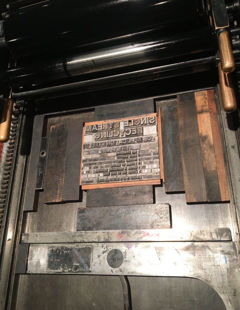
This year, I’ve decided to take a typography class, and learn more about the basics surrounding type, design, and the tools we use to make words more interesting. In this class, we gain access to a press machine called a Vandercook, which is a rolling press which prints our type onto paper.
For those who are curious, this is what the basic process looks like:
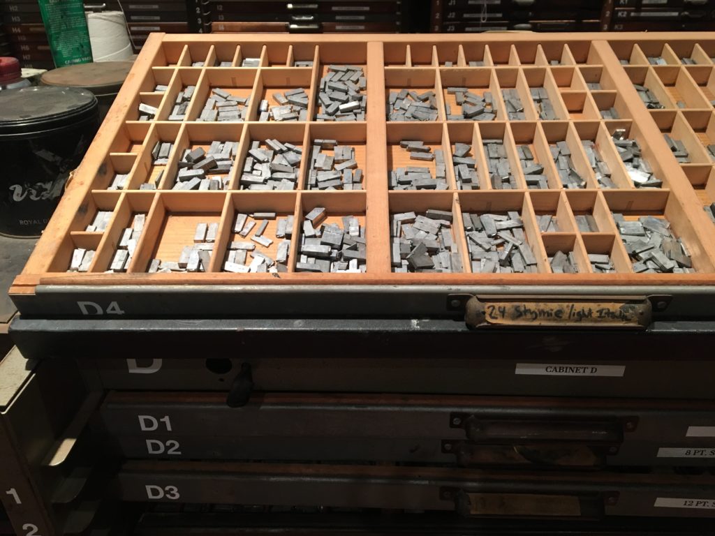
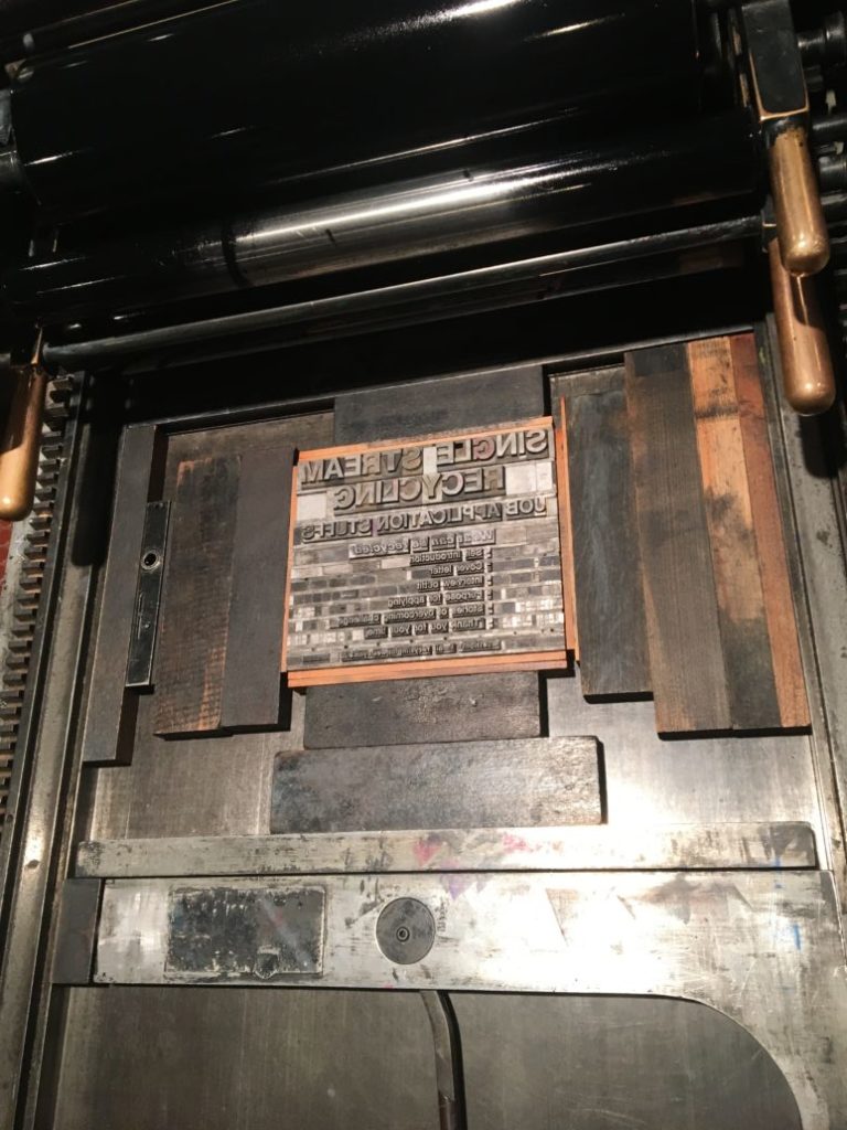
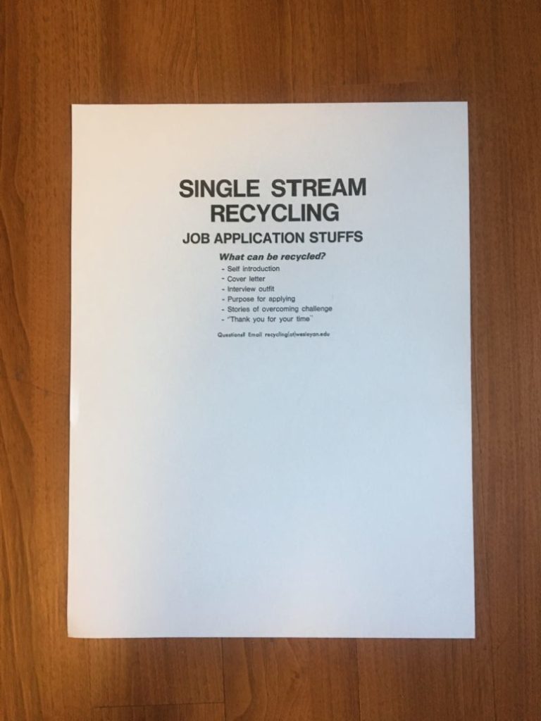
For such a simple poster, it took about 10 hours to make this total 😱 But something you can’t quite see in the photo is the nice, heavy quality of the paper and how the text is really embedded into the paper, creating a sort of minor engraved effect.
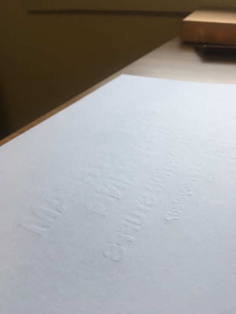
This class is quite therapeutic, and an important hobby to make my kind-of hectic life feel a bit more well-rounded. The process of placing type, organizing text, and choosing paper to create a final design– it’s a long, but thoughtful practice that serves as a calming activity.
Unlike watercolor or painting (which I also enjoy as a means of therapy), typing requires a certain mathematical and calculated ability. The lack of free form, which might feel limiting to some, is actually kind of nice, as I need to follow a set of rules and restrictions to create my piece.
Hopefully I’ll be able to start printing some postcards to send to friends and family! This piece I made is quite simple (it was my first “real” project), but with variety in paper, font type, spacing, and depth, I hope to create something really beautiful that I can share with others.