If you’re interested in design, technology, and/or entrepreneurship, chances are you’ve listened to Steve Jobs’ Stanford Commencement speech.
A famous moment in that speech, Steve Jobs talks about how auditing a calligraphy class at Reed College contributed to his success with Apple:
“I decided to take a calligraphy class to learn how to [learn calligraphy]. I learned about serif and sans-serif typefaces, about varying the space between different letter combinations, about what makes great typography great. It was beautiful. Historical. Artistically subtle in a way that science can’t capture. And I found it fascinating. None of this had any hope of any practical application in my life. But 10 years later, when we were designing the first Macintosh computer, it all came back to me. And we designed it all into the Mac. It was the first computer with beautiful typography. If I had never dropped in on that single course in college, the Mac would never have multiple typefaces or proportionally spaced fonts. And since Windows just copied the Mac, it’s likely that no personal computer would have them.”
I’m currently a senior at Wesleyan University, meaning that it’s becoming quite apparent to me that my life as a student is nearing its end. I’ve taken incredibly fascinating courses, really boring ones, required courses, and courses that would fall in-between and along that spectrum. As my time left at Wesleyan becomes more limited, I’ve understandably become quite selective about the courses I take.
Similar to Steve Jobs, I’ve decided to attend a liberal arts school, and so I have room to take classes that fall outside of my major, which is Economics. So naturally, following in the footsteps of a leader in design and technology, I’ve decided to do the same: let’s take a Typography class.
PART I: Sourcing Materials and Ideas
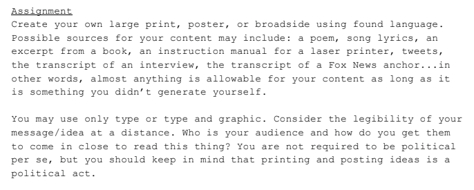
One of our first projects was to create a broadside, also known as a poster. Here was our prompt:

After a few days juggling a few ideas, I decided to choose a text by a Japanese businessman named Mitsuo Ohashi, who used to serve as Chairman for Japan Chemical Industry Association. Now retired, back in the day he was well-known for being an aggressive and strict man. In an interview with Nikkei, Japan’s national financial newspaper, he gave a rather surprising quote:
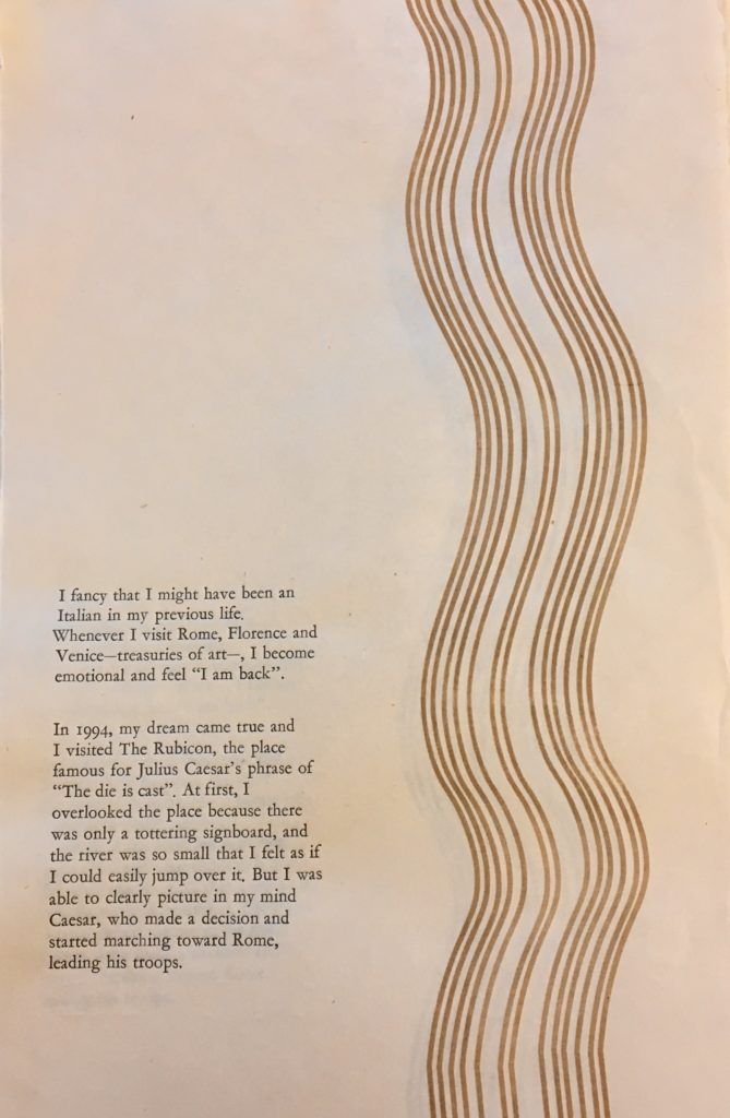
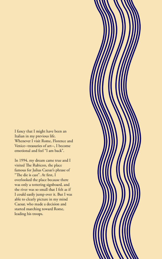
“I fancy that I might have been an Italian in my previous life. Whenever I visit Rome, Florence, and Venice–treasuries of art–, I become emotional and feel “I am back”.
In 1994, my dream came true and I visited The Rubicon, the place famous for Julius Caesar’s phrase of “The die is cast”. At first, I overlooked the place because there was only a tottering signboard, and the river was so small that I felt as if I could easily jump over it. But I was able to clearly picture in my mind Caesar, who made a decision and started marching toward Rome, leading his troops.”
I chose the quote because it was both out of character yet completely fitting for a ruthless businessman to say something like this. While on the one hand he is referring to a side of himself that loves art and romance, he still managed to refer back to leadership and rule. The way he reflected himself onto Julius Caesar was unexpected yet fascinating, and I thought it would be a cool piece of text to work with.
I first scoured the internet for ideas, and how I could represent his words on paper. Scrolling through Pinterest, Instagram, and online shops like Society6, I found a few designs I liked:
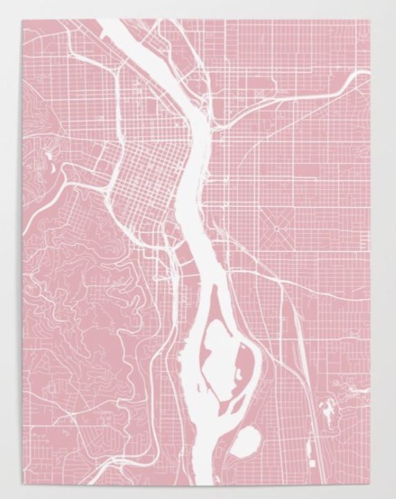
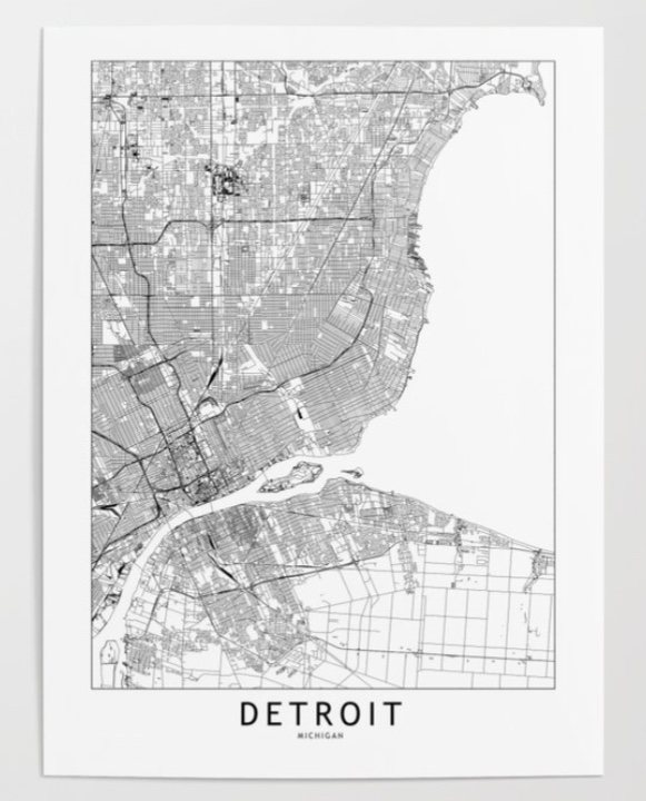
I liked the map, but felt that the gridlines made it look too modern, and wanted the broadside to reflect something with history. So instead of tracing the entire city, I went on Google Maps, searched the Rubicon, and outlined a portion of just the river in Illustrator.
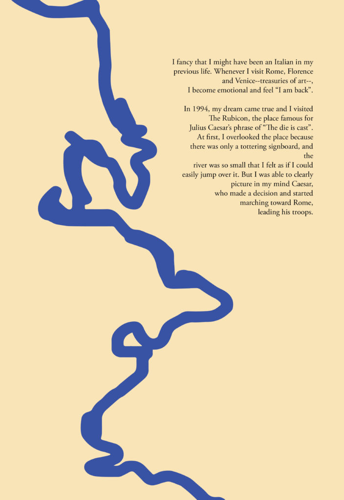
My river looks… like a squiggly line.
PART II: Redesign
I decided that I would have to represent the river in a different way. Going back online, I found inspiration from a unique source:
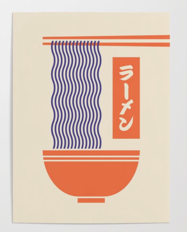
That’s going to be my river!
PART III: Woodblock Printing
I had to make my own printing block if I wanted to print this, and I had two options to do this:
- The first would be to do a linoleum cut, where I would take some carving tools and basically create a stamp—- if you’ve ever etched away at erasers in elementary school to create some DIY stamps, the process is similar.
- The second would be to do a laser cut, which is what I decided to go with as I wanted my lines to be precise and clean.
I drafted my file in Illustrator, cut out a piece of wood to the required size, and then sent it over to our school’s laser cutter. Basically what the laser cutter does is that it reads the black space as space that needs to be rastered, or burnt away.

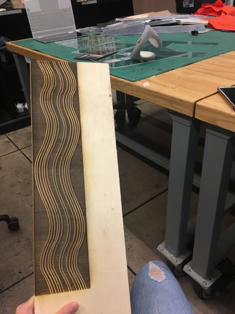
The dark bits are parts that are lowered, while the skinny white lines are what remains on the surface. So if I put it on the letterpress, I would just get skinny lines printed on the paper! Proud of my piece, I was excited to use it.
PART IV: A Problem
Unfortunately, my woodblock piece suffered some damage and some of the lines chipped away. I couldn’t justify the inconsistency in the smoothness of the lines, and so had to problem solve quickly. Without access to the woodshop and unable to find a piece of wood at the right height in time, I decided to go with the secret option 3 for bringing my Rubicon illustration alive. We’re going to skip the wood block and directly raster the paper.
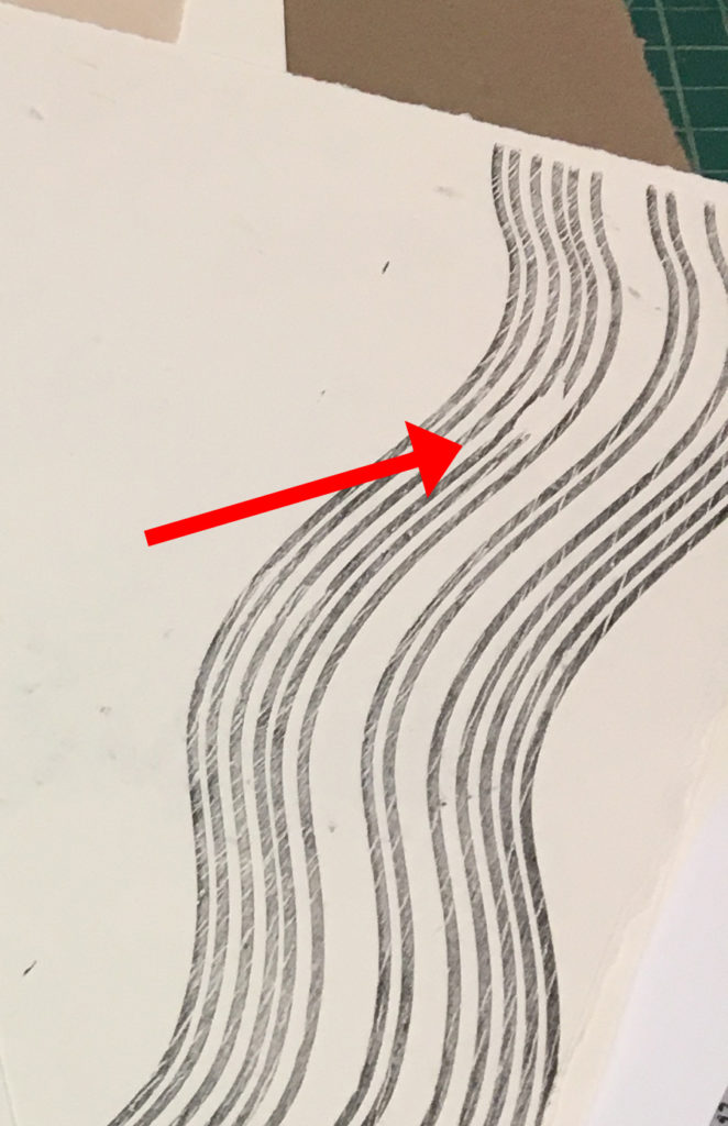
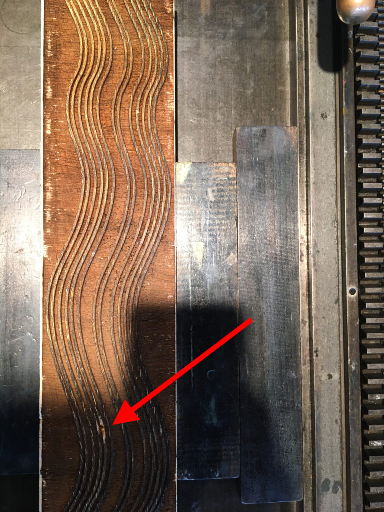
Because rastering the paper means burning away the top layer of the paper without actually cutting through the paper, it makes it very delicate. In fact, I was planning to use washi paper which is already delicate material to begin with, so rastering it would make it extra delicate.
So going back a bit, I decided to print my type on the letterpress first and then raster my paper.
PART V: Printing Type
I set my type, choosing the font Garamond in size 18. I justified it left, and let the words on the right hanging out a bit so it would gently “hug” into the river, without being so obvious as text wrapping.
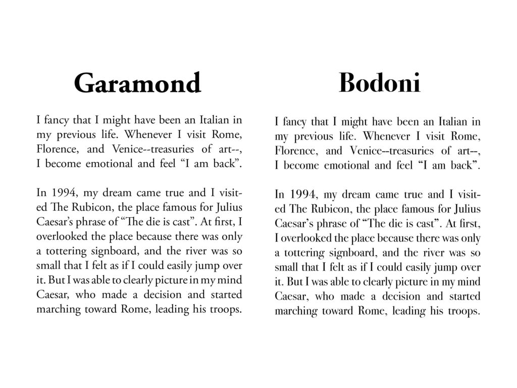
Garamond is a good body text to use if you’re looking for something in serif. Established in the 1500s, it’s an old font style, but its popularity survived to the 21st century for its simplicity and legibility. Compare the readability in Garamond with Bodoni *which is also a serif font, but is considered title text and not so good for sentences:
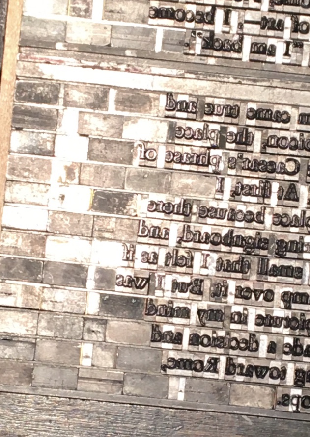
Unknown to many, setting type is actually one of the most annoying/peaceful things you can do, depending on what kind of person you are (I’m the latter). Each letter is a little tiny piece, as well as every space, and you have to fit it onto the press bed for fitting. It works like a puzzle, and you have to fill in the empty spaces with no lettering with wooden block pieces called furniture.

Once it’s all secure, you can feed in your paper and roll it in!
After I printed 10 successful copies, I headed back to the laser cutter for my redemption.
PART VI: Rastering Washi Paper
Rastering paper is a delicate process, so I had to play with the speed and strength to make sure I would accidentally rip through the paper.
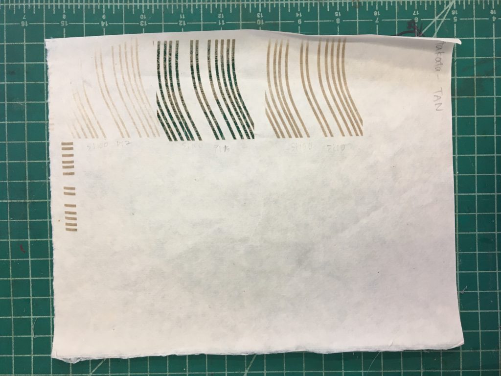
Once I figured out my settings, I put it in the laser cutter for rastering.
An FYI, each print took 25 minutes to raster, and I had to make 10 editions, so in total it took… way too many hours. But I still got it done!
PART VII
As a final part of the project, we were to put our broadsides in different locations around campus, where they would influence, change, subvert, or enhance the meaning of its surroundings or the text itself.
I decided on three locations:
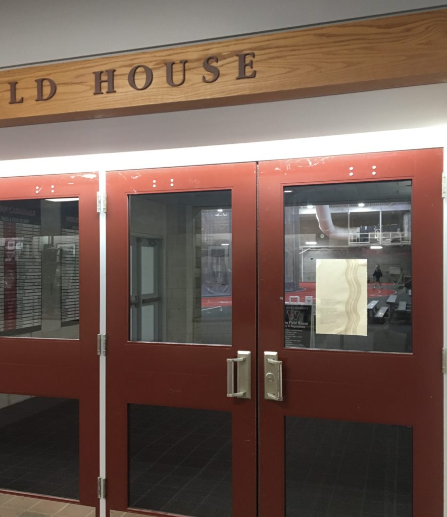
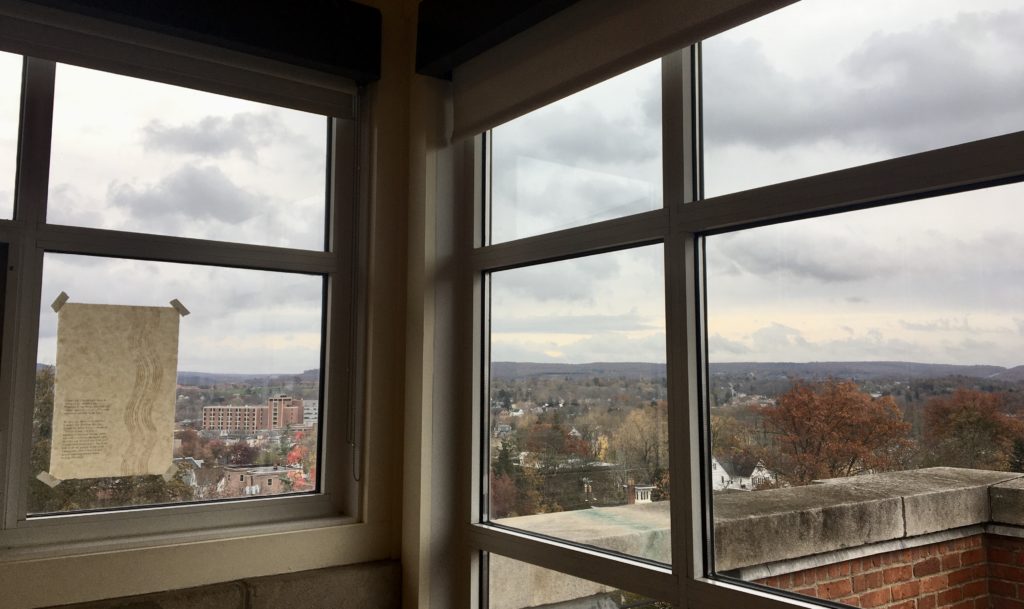
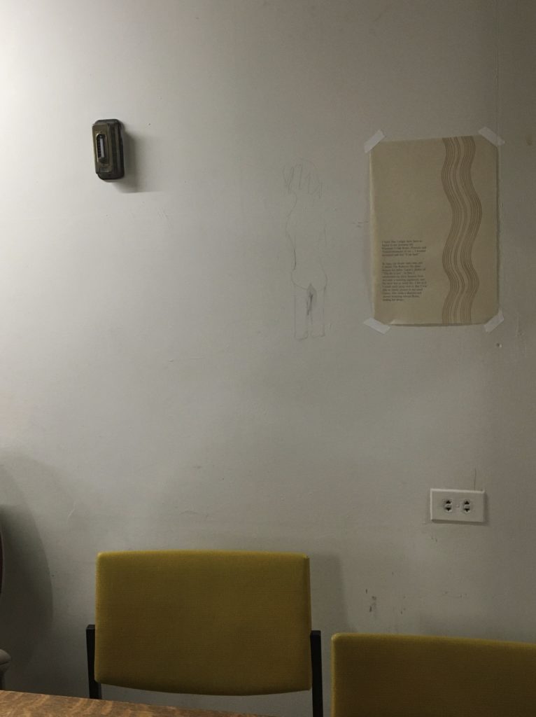
Surprisingly, putting up posters was some anxiety-inducing work. Unsure of whether what I was doing was okay or not (it kind of felt like vandalism?) I quickly got in and out, minimizing the number of people who could see me haha.
Location 1: The indoor track and field. For starters, the Rubicon kind of looked like a track on my poster, so it felt right for it to be near one. Alluding to track and field’s Greco-Roman roots and the theme of leadership, it also felt right for the poster to be located near a sports center. Also, it was very uncharacteristic for such a delicate and poetic piece to be placed in such an athletic, modern space, which made it more interesting.
Location 2: The top of the Allbritton building. We have a beautiful building on campus that overlooks Connecticut and our town. In the fall, the autumn foliage is absolutely stunning, and I also liked the way my poster looked with such a beautiful background. Difficult to see in my photo, but the lighting also added dimension to the piece— because the rastered lines were of thinner material, line shone through differently from the untouched washi paper.
Location 3: The basement of Olin Library. Wesleyan has this really beautiful, old library on campus. Exploring spaces I could put up my poster, I found this random drawing of a lady’s butt on the wall next to a study table in the basement. Fluorescent lighting, no windows, and eerily quiet, it’s far from a beautiful space, but imagining a student struggling at 2am going a bit crazy and finding ways to procrastinate by drawing a naked lady kind of made me laugh. I posted my broadside next to the lady, hoping to add some entertainment for Wesleyan students who may find themselves stuck in the basement of our library.
Conclusion:
I can see why this kind of material was so fascinating to Steve Jobs. Learning about serif and san-serif, negative space, and how to transform text to create a message and meaning— design has so many layers you need to think about before you reach the final product. Paper quality, font choice, font layout, representing Rome, and representing memory, I had to figure out a way to use design to draw a reader in from afar and make them look closer at my writing.
When Steve Jobs talked about the typography of Macintosh computers, he was obviously directly addressing the lessons he learned about font and how they contributed to Apple’s design— but for me, typography has also contributed to a bigger lesson in the process of good design. It’s intricacies and subtleties, the little details that go unnoticed by the viewer (and perhaps should stay unnoticed), and how they all work together to create meaning.
The broadside was a fun first major project, and I’m excited to see how my work will develop by the end of the semester. Who knows, maybe taking a typography class was my version of crossing the Rubicon? Steve Jobs can be my Julius Caesar.
